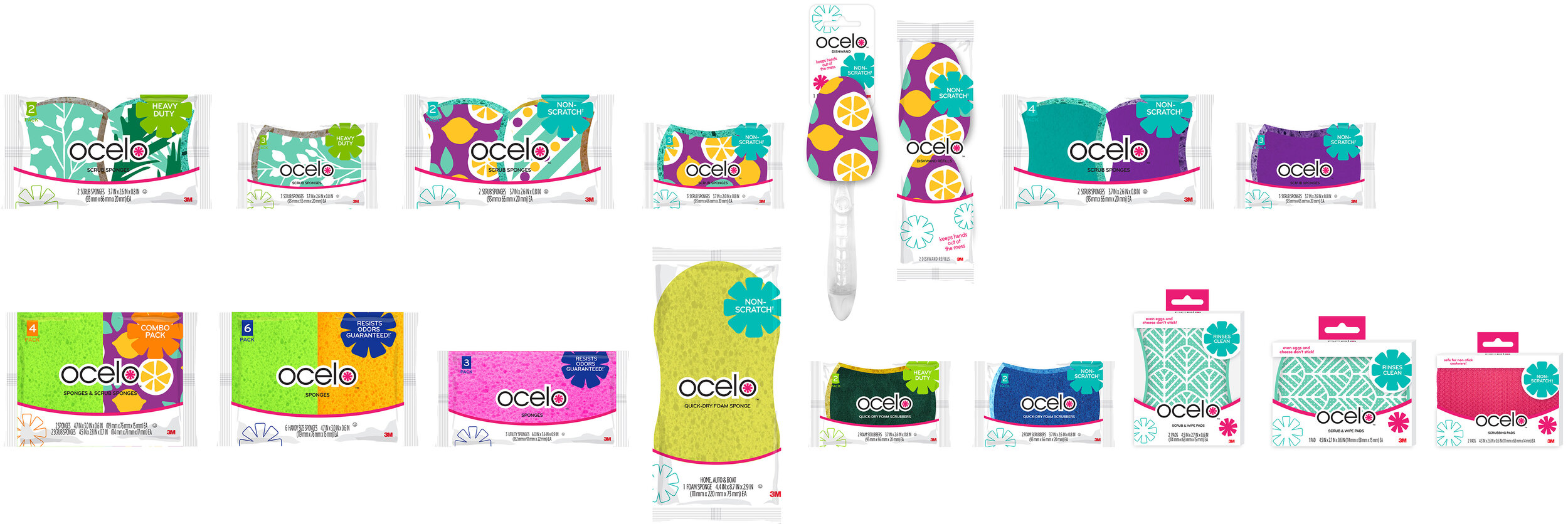
Ocelo™ Scrub Sponges
COMPANY: 3M // BRAND: Ocelo™
THE ASK //
Differentiate the Ocelo™ brand products from it's sister brand, Scotch-Brite™, by reflecting the brands unique consumer target through color and pattern.
Provide consistent customer news and updates from the brand with a streamlined pattern rotation process.
DESIGN OBJECTIVES & SUCCESS CRITERIA
Design product collections to align with current market trends and fit within the kitchen settings of the target consumer’s personal style. Patterns must be designed on a macro-scale and under 6 colors to accommodate the printing process and product material.
PROJECT EXPERIENCE //
Trend research & creative development for pattern designs, packaging extensions, seasonal campaigns and product look-books for the Marketing and Sales teams
Business analysis of consumer research results
Development of production process between cross-functional teams starting from concept ideation to finished goods in store to ensure smooth transitions of pattern rotation and product launches
Concept presentations to cross-functional teams for alignment
Pre-production product sample reviews from print vendor to ensure print quality
Trend Research
Leverage trend forecasting resources and international partners to identify, validate, and apply color, material, and graphic trends to the product portfolio.
Concept Ideation
Develop preliminary color and pattern concepts based on design trend research and place in quantitative consumer research to identify what is resonating with the target market.
Pre-Production Prep
Prep art files for print production and review material print samples for quality control.
Final Product
Rollout pattern collections to retailers.
Packaging Extension
Using the Ocelo™ key visual equities (logo, color and sparkle assets), packaging was updated and optimized to establish a cohesive look across the Ocelo™ product line.
The packaging update ensures the patterns, colors and patented product shapes are visible through the packaging graphics, while also effectively communicating the relevant product benefits with a designated callout area so consumers can easily identify product differentiation.


